File Manager Case Study
Methods Observation, interviews, user research, wireframing
Tools Windows File Explorer, macOS Finder, Adobe Photoshop, Figma, Whimsical
Problem How can problems with file managers be mitigated?
Solution Windows File Explorer: faster searches, tabbed windows, and file tagging by color.
macOS Finder: quicker indexing, rapid file transfers, and performance improvements.
Research
I observed a friend organizing her computer files. She quipped Windows File Explorer was easy to use and strongly preferred it to macOS’s Finder.
I became curious how people organize their files and use file managers.
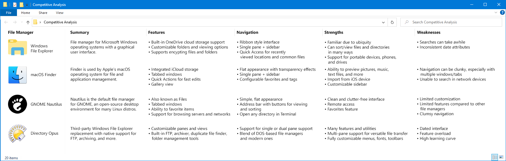
Competitive analysis of Windows File Explorer, macOS Finder, GNOME Nautilus, and Directory Opus.
I sent a Google Forms survey asking users about their file manager’s pros and cons, suggested improvements, and how they organize data.
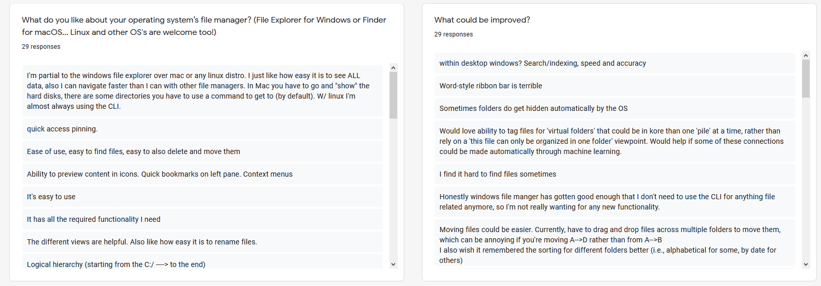
Several Google Survey responses
4 phone interviews were conducted with those who used macOS Catalina, Windows 10, or both.
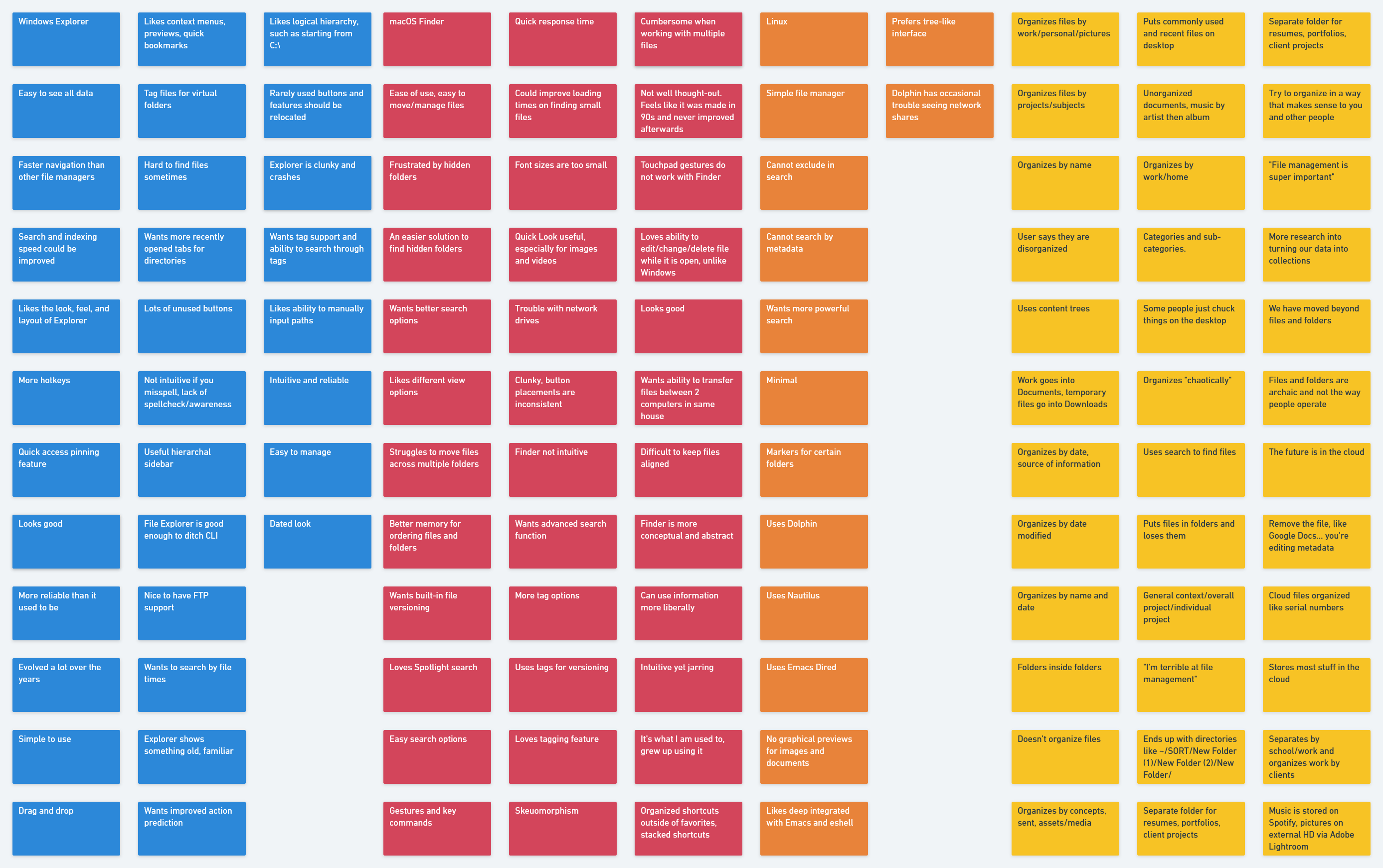
Affinity map created with Whimsical
Common complaints:
• Slow searches
• Too many buttons
• Cumbersome multitasking
One user said they “organize chaotically.” Several others do not organize their files.
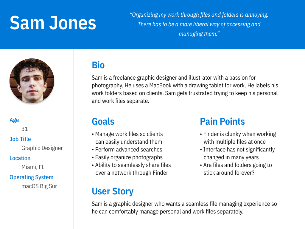
Sam’s persona
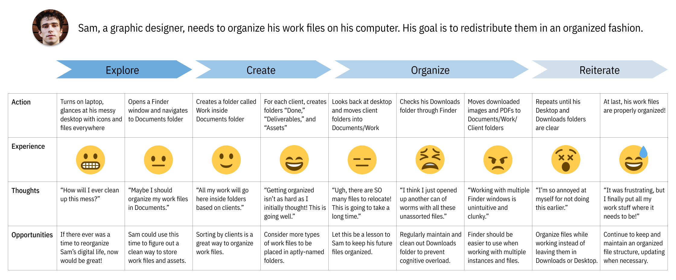
Sam’s file organizing journey is a roller coaster, but he is satisfied with the results.
Users might not organize their files due to time constraints or becomes overwhelmed restructuring their data.
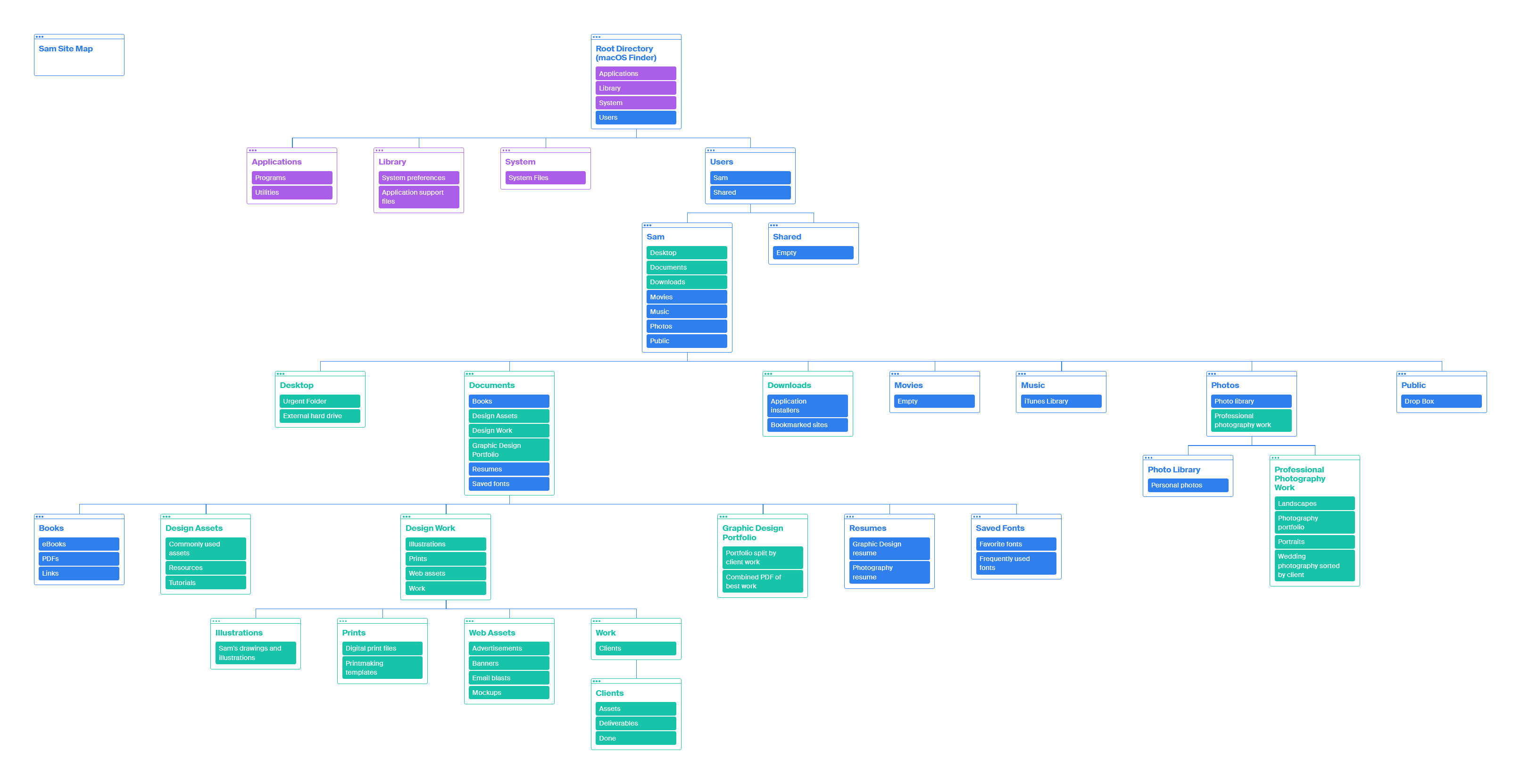
Sam’s site map
This sitemap visualizes how users could quickly organize their files without confusion.
Design
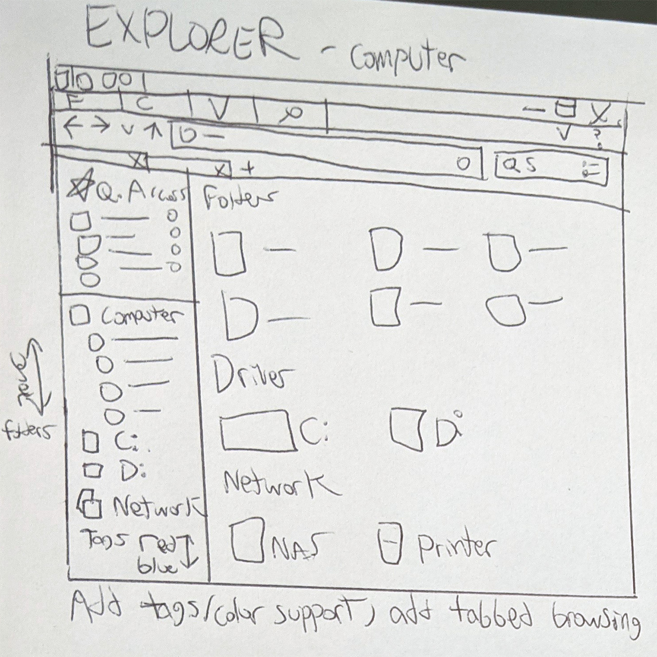
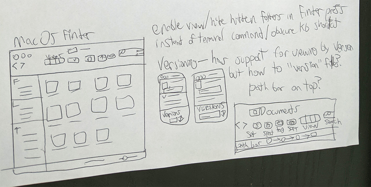
Paper sketches of Windows File Explorer and macOS Finder
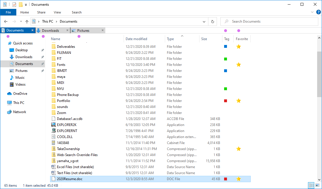
Based on user feedback, I added tabbed browsing in Explorer and Finder’s buttons and menus were rearranged.
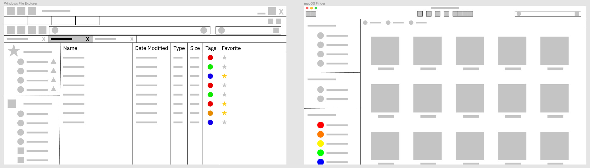
Top: Windows File Explorer wireframe
Bottom: macOS Finder wireframe
Windows File Explorer
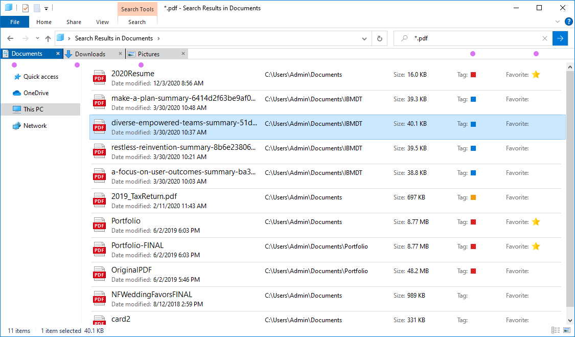
As requested, color tags were added.
Users can now favorite individual files and folders.
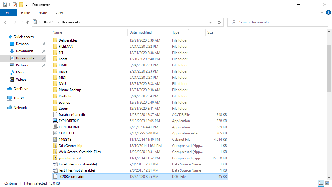
Top: Original File Explorer screenshot
Bottom: My mockup
Favorites and tabbed browsing were applied.
A participant suggested circular tag icons should be squares to align with Windows’ iconography.
Search Improvements
Windows users complained about the advanced search location. I implemented a permanent search button with options on the top left home row.
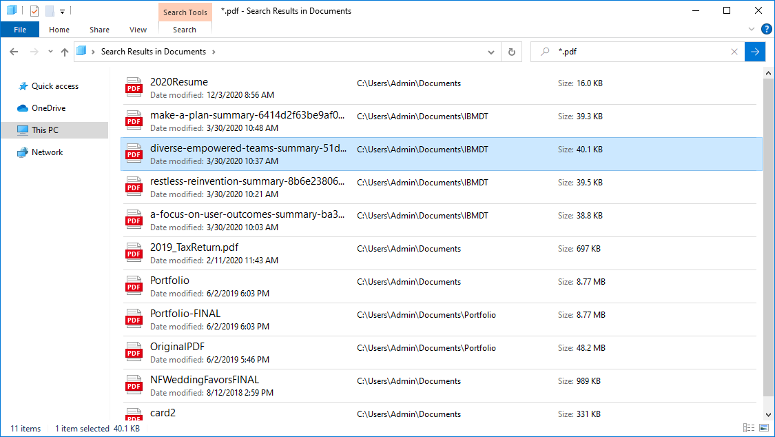
Top: Original screenshot of Search Results
Bottom: Mockup of new search results
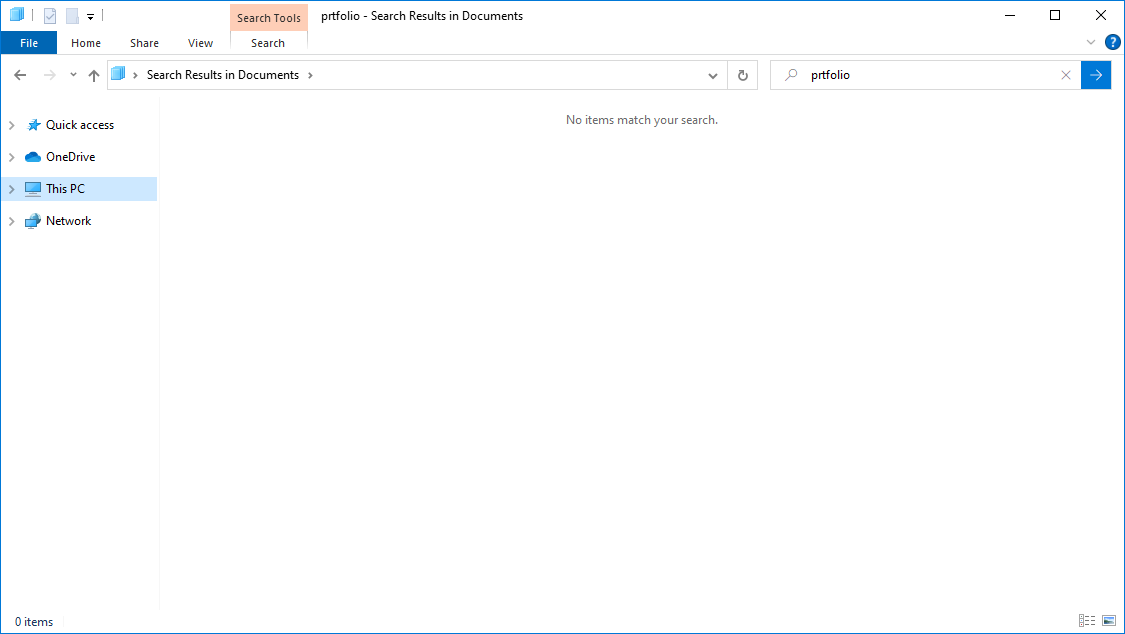
Misspelled search term
No results for misspelled “prtfolio.”
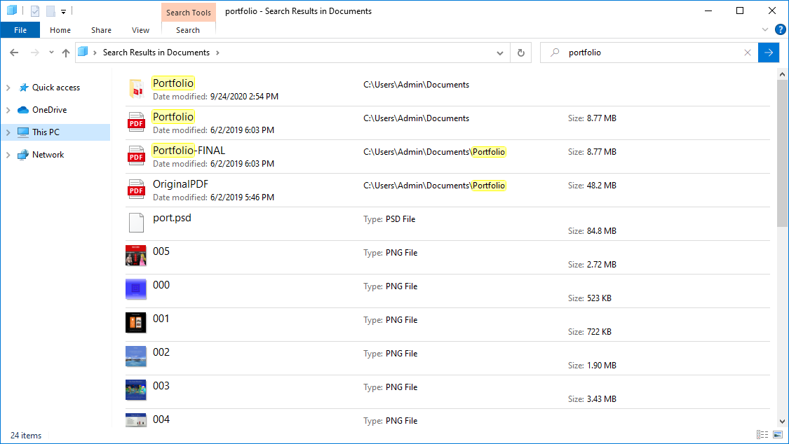
Correct Spelling
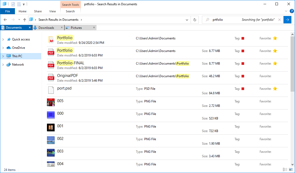
Spellcheck aware search
Ideally, file managers would detect misnamed files and folders.
macOS Finder
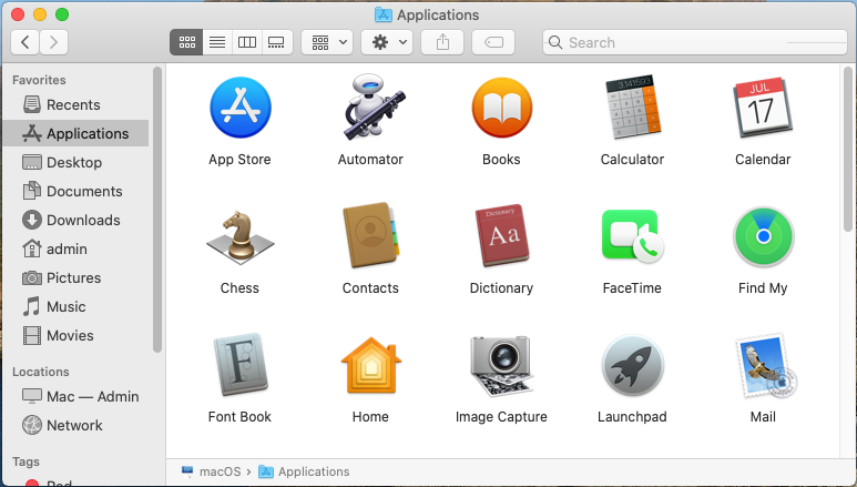
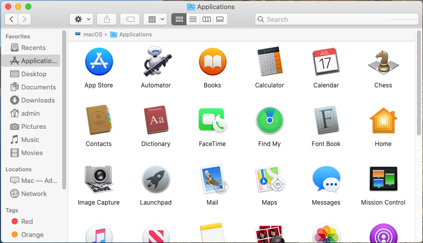
Top: Original macOS Finder screenshot
Bottom: My revisions
• Improved local and network data transfer time
• Rearranged settings, sort, tags, and view buttons in a more consistent order
Users want a faster Finder which remembers their individual folder settings.
The Path Bar was moved to top.
This reduces interaction cost.
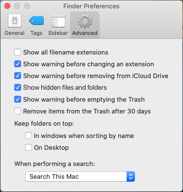
Enable/disable hidden files and folders
Some Finder users could not locate where to show hidden files and folders.
Finder Preferences should include this option. Otherwise, users must type a Terminal command.
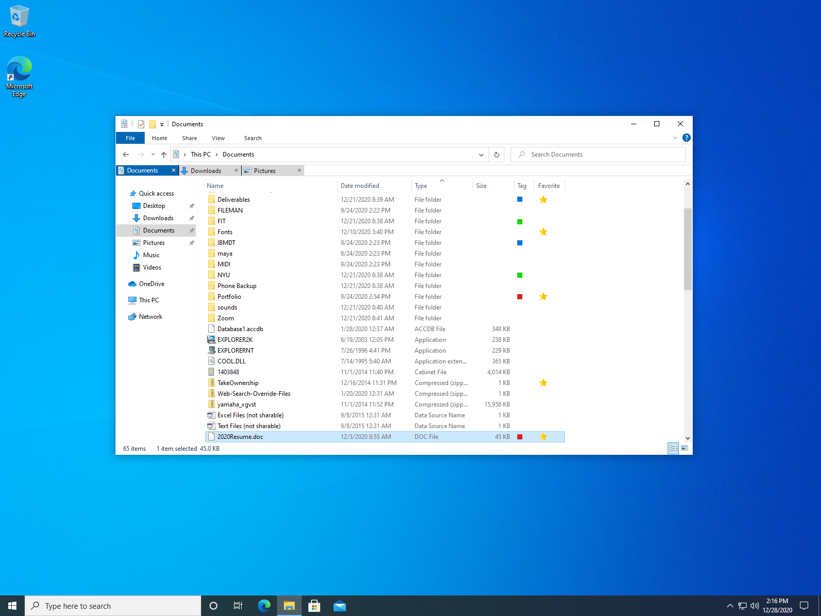
Windows 10 with improved File Explorer
Takeaways
• Organized users had considerably less frustration
• Cognitive overload and time constraints kept disorganized users from sorting files
• Developed a deeper understanding of hierarchy
• Users wanted improved search times, more search options, faster transfers, tags
This project was a great opportunity to observe participants in their digital environments. I experienced innovative findings and surprises during research. I learned about properly conducting surveys and user interviews.