Doctorlingo
Team Anuja Raste, Crystal Shen (Design Lead), Holli Smith, Nabil Mir, Rodrigo Flores
Methods Design concepts, color theory, user research, user stories, wireframing, low fidelity and high fidelity prototyping
Tools Figma, Gitlab, Adobe Photoshop
Problem How can we define medical terms so anyone can understand them?
Solution Doctorlingo is a medical translation service which translates medical documents through Optical Character Recognition (OCR).
Research
Doctorlingo was created by medical student Josh Calvano and physician Shuhan He. They wanted to simplify medical terminology for patients and their loved ones.
Doctorlingo’s team consisted of remote volunteers, including software engineers, marketers, translators, and UX designers. The site was not yet publicly available.
We created user stories for patients and their family members, non-English speakers, those who wanted to translate medical documents to their native language, and anyone who sought quick medical term definitions.
Doctorlingo offers:
• Simple definitions for medical terms written by certified healthcare professionals
• Upload and translate medical documents with confidentiality
• Multilingual translations
• Trending words
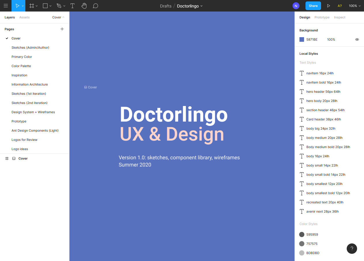
Figma file
Our design team met weekly via Zoom to discuss deliverables and usability issues. We used Google Docs for meeting notes and the GitLab chat and ticket system. Sketches, prototypes, and style guides were designed in Figma.
Doctorlingo was awarded a Spark Grant by Harvard Innovation Lab.
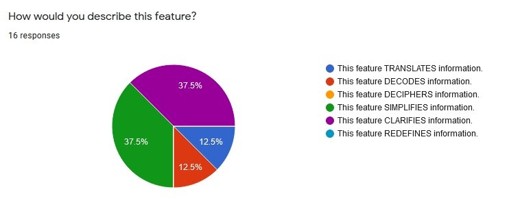
Google Survey for medical translation
Based off a Google Survey asking doctors, patients, and non-native English speakers, we used “translate” for the medical document translation feature.
Design
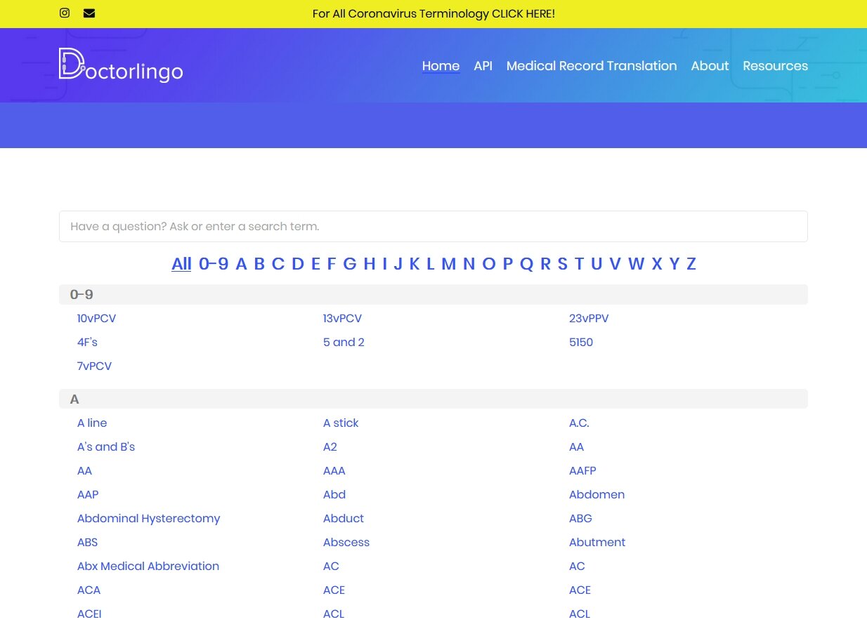
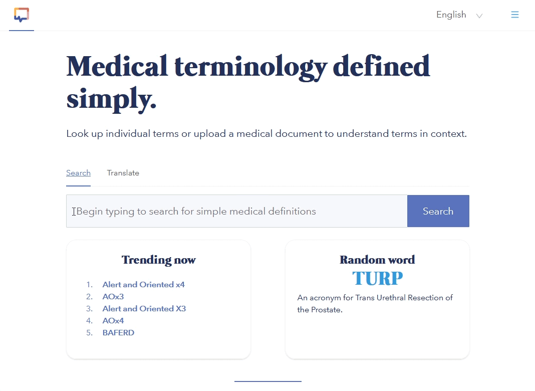
Beta version of Doctorlingo, before redesign
Initially, we combined the Search and Translate function. The development team had concerns about technical limitations, so we split the Search and Translate pages.
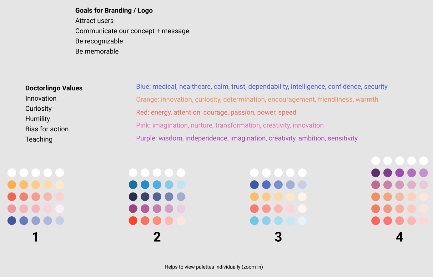
Color palettes
For branding, bright colors were used to promote serenity and trust.
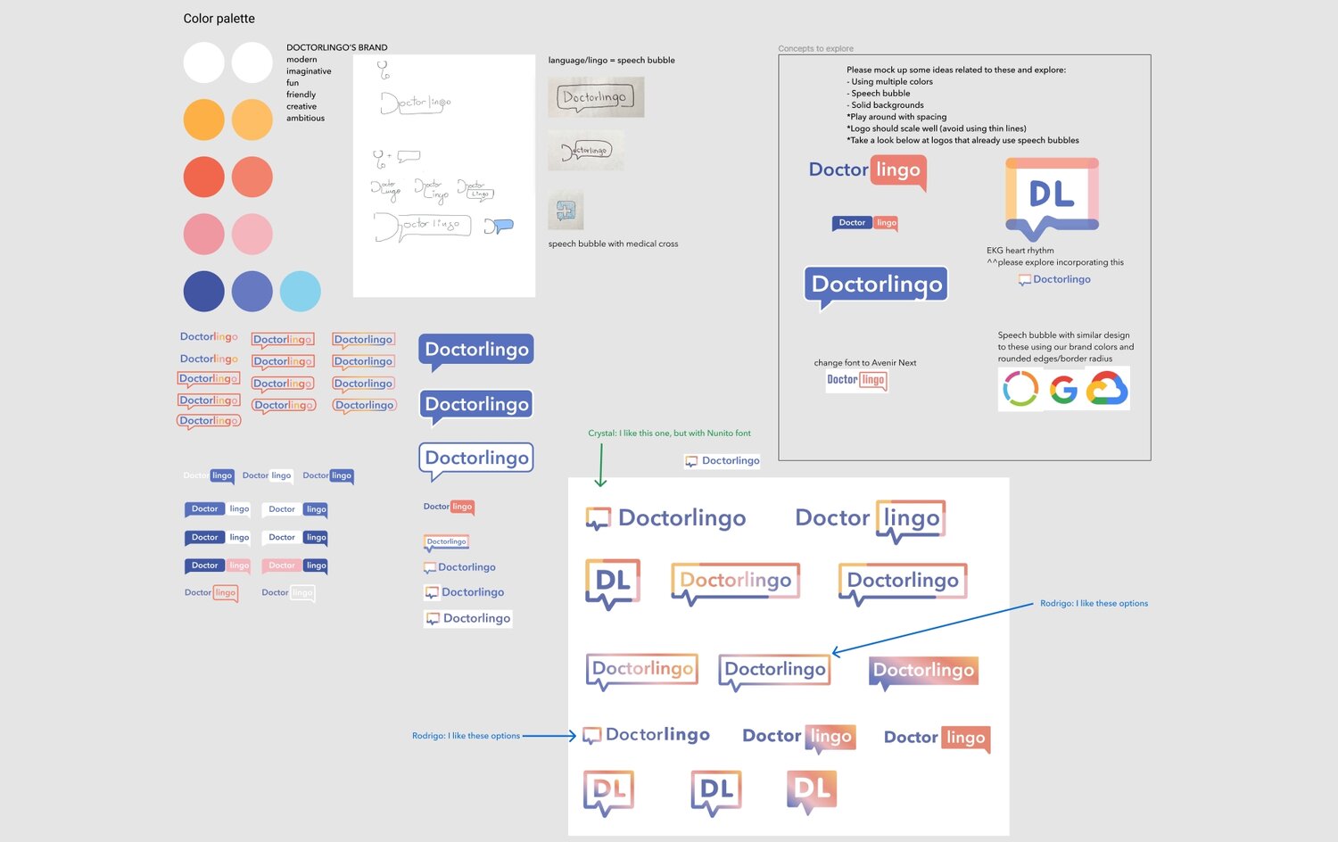
Plethora of logo designs
I created several logos and our team reiterated them based on feedback across all teams. Holli, our accessibility engineer, ensured colors passed usability guidelines for accessible web design.
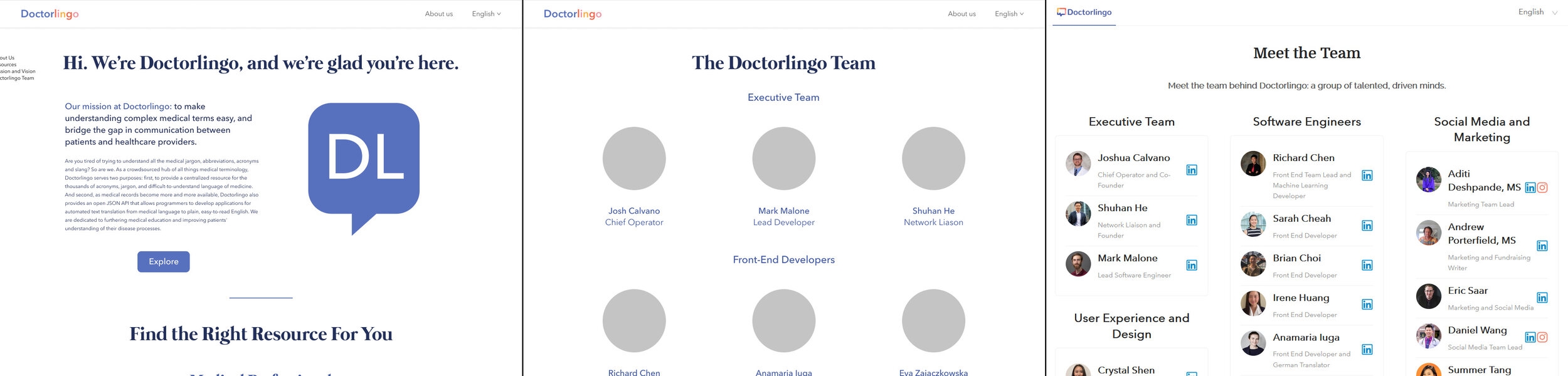
From left to right: About section, Team page, final version of Team page
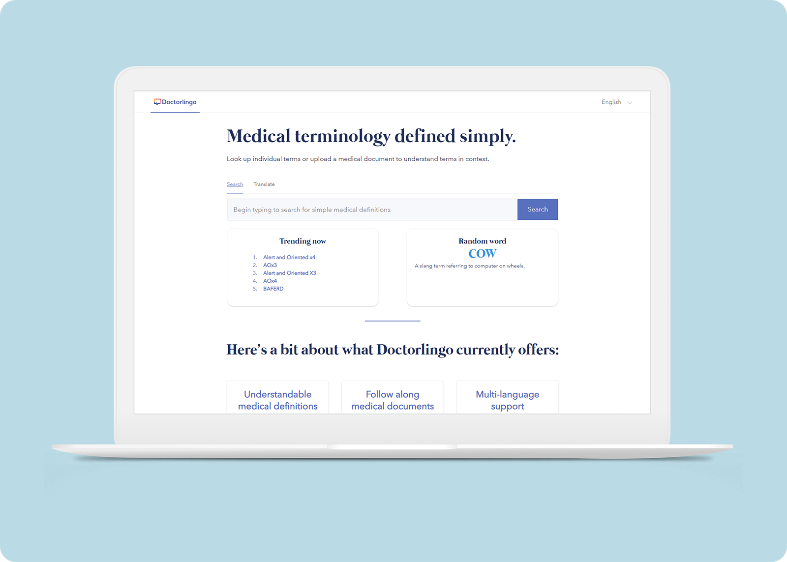
Doctorlingo, powered by Ant Design framework, launched smoothly on September 20.
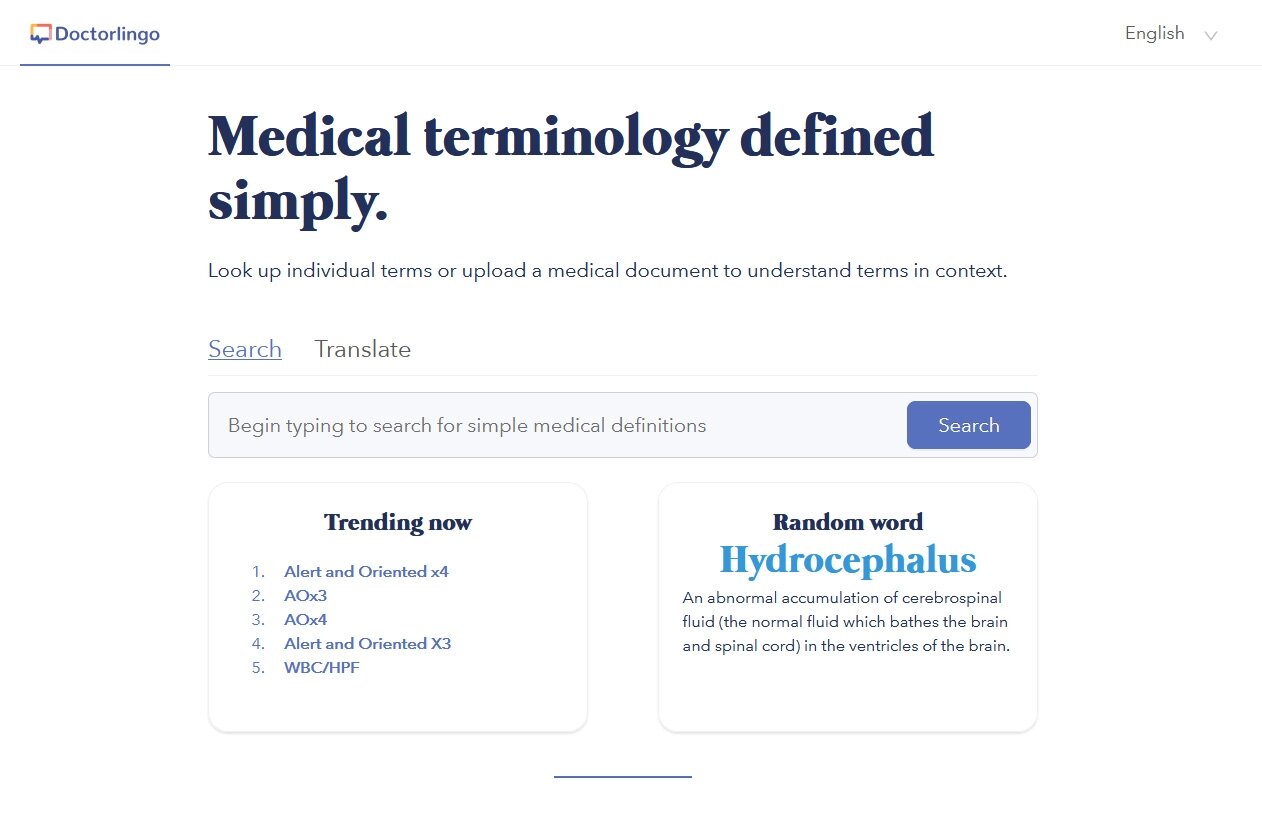
Doctorlingo Version 1.0
Takeaways
I learned about...
• Implementing user feedback to the design in a holistic, team-oriented manner
• HUsing contrast checkers for accessibility and designing for visually impaired users
• Working collaboratively to solve functional issues within time constraints
• Improving iconography and visual design skills
It was fascinating to focus on the user experience of a project while witnessing Doctorlingo evolve from beta to launch.